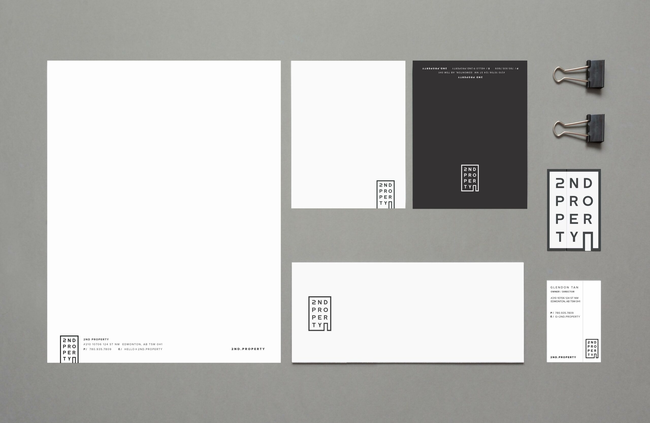
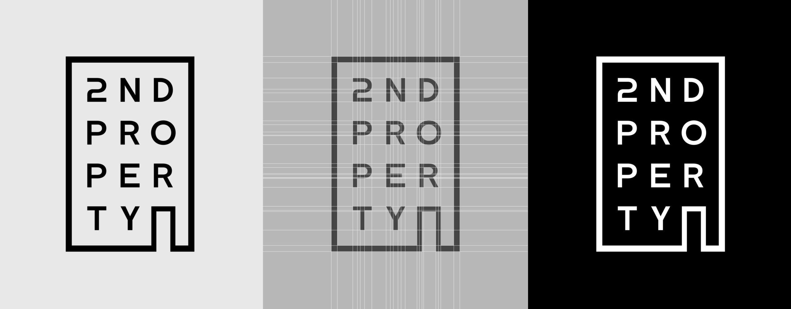
2nd Property Logo Concept
2nd Property is a new property management company that specializes in the management of commercial buildings. Our objective for the logo was to create a design that would blend in well with other logos, as it would be displayed alongside many others at the building. For this reason, we decided to go with a monotone color scheme that complements various color combinations. The shape of the logo represents a building to symbolize their focus on commercial property management. The playful design gives clients a sense of fun and relaxation, as owning and maintaining a property can be stressful at times.
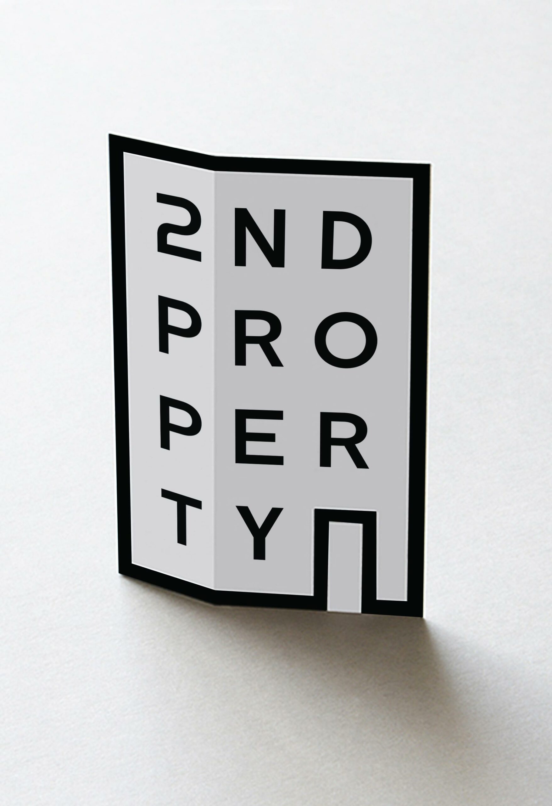
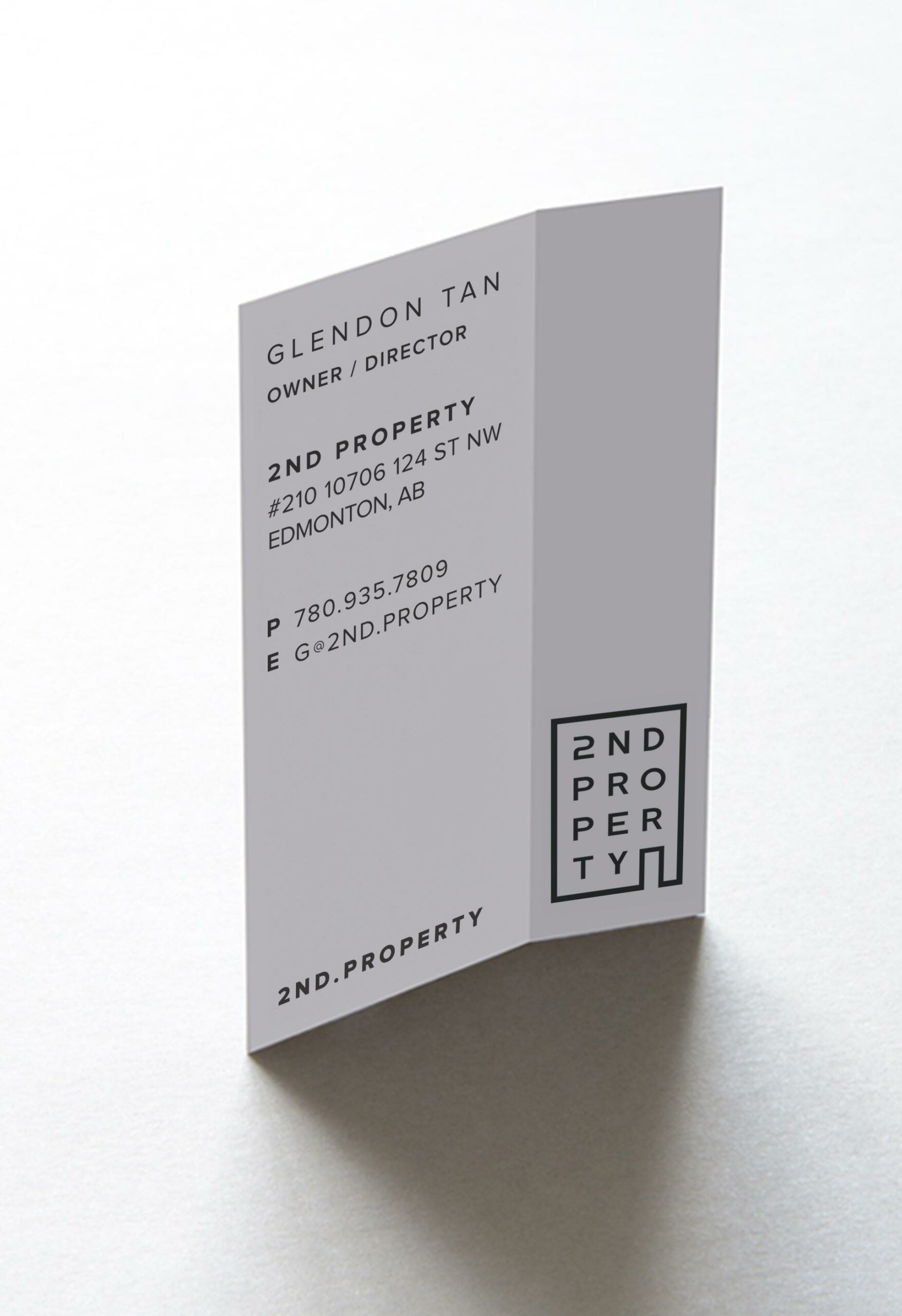
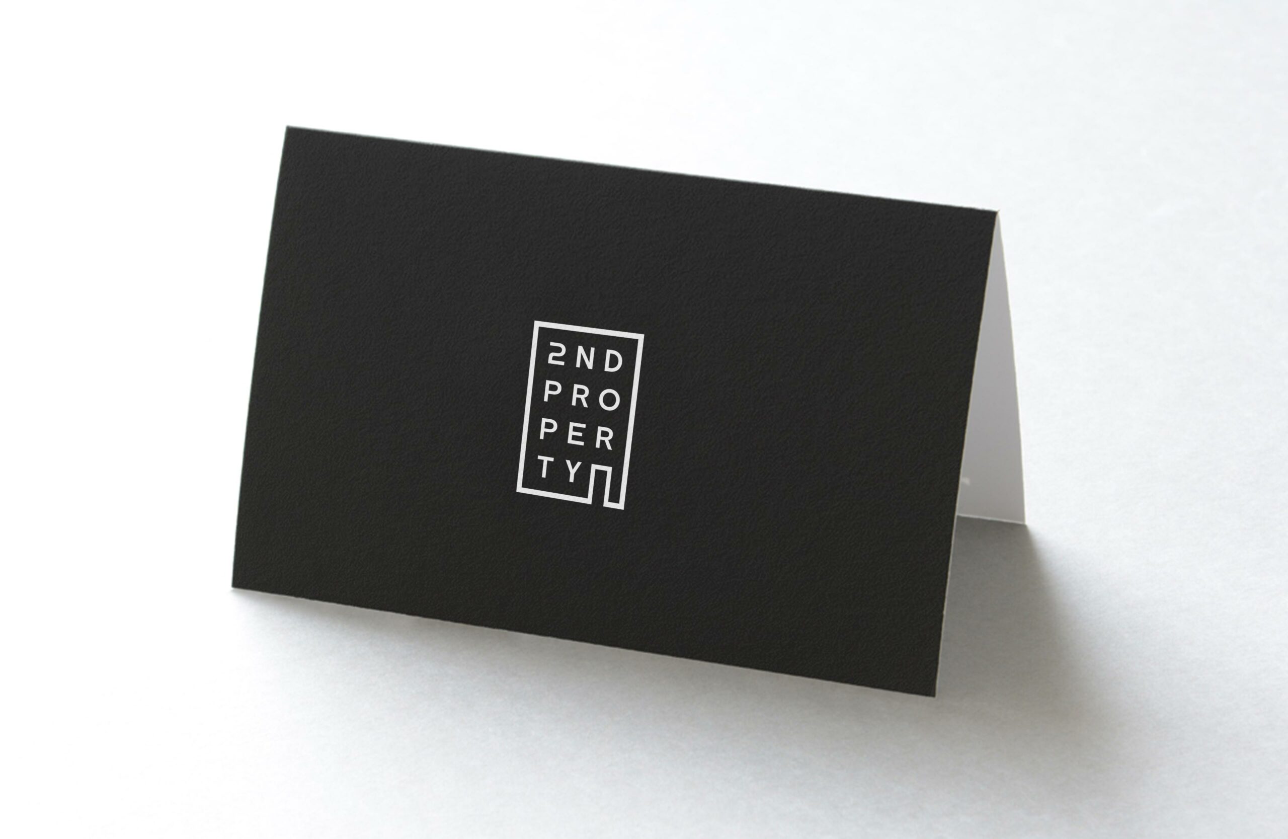
Business Card Concept
For 2nd Property, we designed a business card that features a crease, allowing it to be bent and stand upright on a surface. This business card design mimics the appearance of a building, perfectly reflecting the company’s property management focus. The business card not only serves its traditional purpose but also acts as a memorable and engaging miniature structure, leaving a lasting impression on tenants.