Arc Insurance
Arc Insurance, a newly established insurance broker in Edmonton, Alberta, is committed to delivering exceptional customer service. Their mission is to provide personalized attention and secure the best insurance packages tailored to each client’s unique needs. Guided by five core principles—Trust, Responsibility, Advocacy, Choice, and Knowledge—Arc Insurance brings a fresh and dynamic approach to the insurance industry. Blangk was tasked with creating a brand identity that reflects the vision and values of this promising new business.

Logo Concept
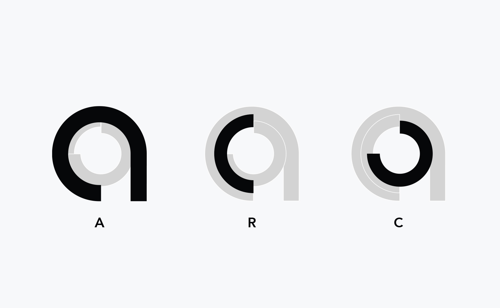
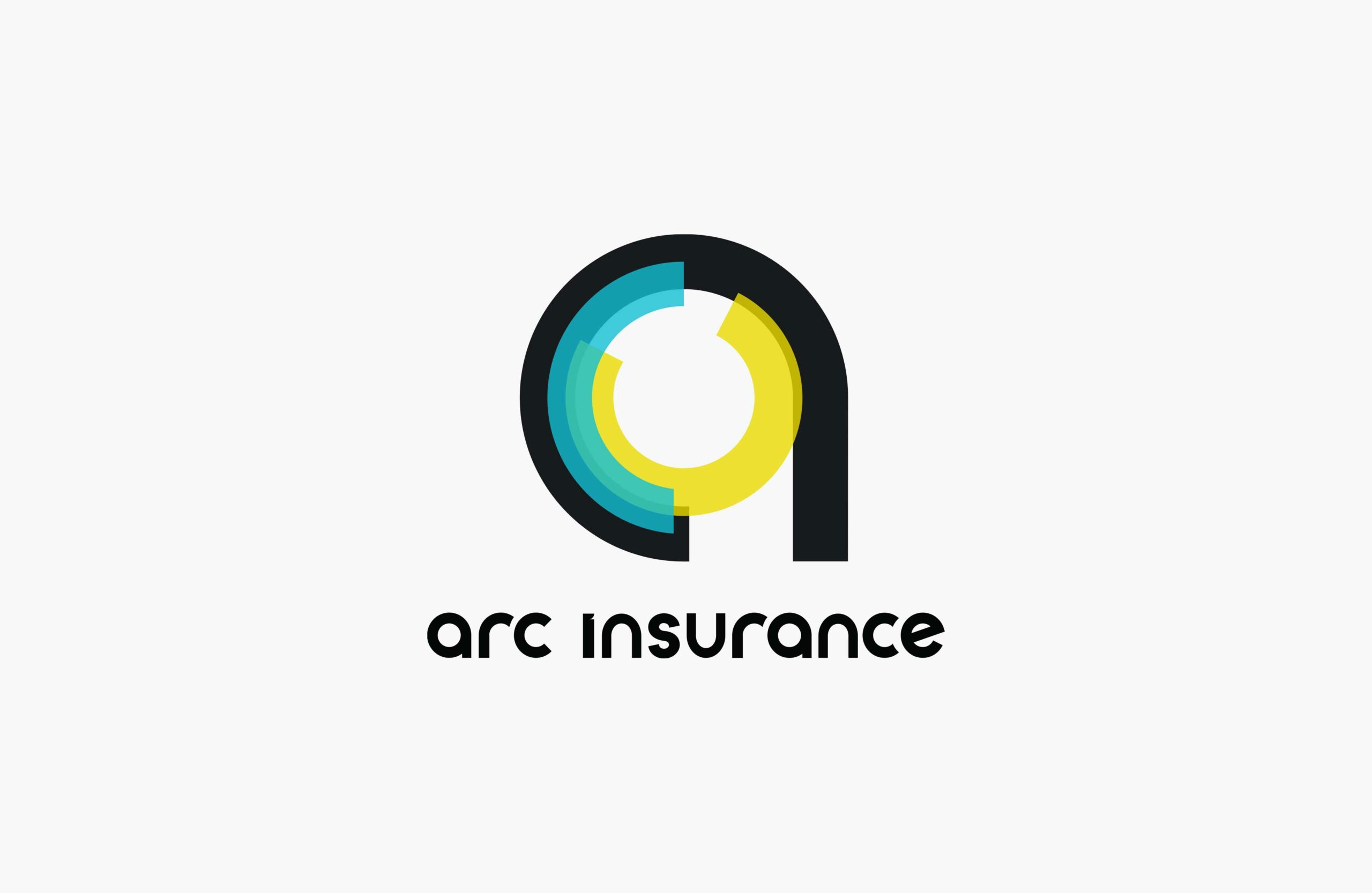
The main inspiration for the logo comes from the concept of a lock, a symbol of security and peace of mind. Just as a safe protects valuable and personal belongings, giving people a sense of reassurance, insurance provides similar peace of mind, safeguarding individuals against unpredictable events that could affect their possessions or lives. The logomark draws from the design of a lock’s wheel pack—a mechanism that encodes the sequence of numbers required to open a combination lock—capturing the essence of protection and reliability at the core of insurance. The curved lines are derived from the letters “a,” “r,” and “c,” forming the word “arc.”
